
Kunha-p Branding Case Study: Bolivian Snack Identity
A Dis Guru Design Studio Case Study
Kunha-p branding case study explores how Dis Guru Design Studio created a bold and joyful visual identity for a Bolivian salty snack. It is inspired by cuna-pe, a traditional cheese-based cracker known for comfort, warmth, and flavor.
The goal was to build a brand rooted in cultural authenticity while, at the same time, feeling fresh and exciting for today’s market.

From the first conversations with the founders, it was clear that Kunha-p needed a visual language that captured more than taste. From the very beginning, this insight shaped the creative direction. It needed to honor Bolivian culinary heritage, highlight the handmade nature of the product. At the same time, the brand had to feel energetic and modern. This balance guided the entire design process.
Kunha-p Branding Case Study: A Logo with Cultural Energy
The logo development began with a type-centered approach. After exploring several options, we chose the font Bungee because of its expressive, energetic character. Its thick, playful strokes mirror the vibrancy found in Bolivian street culture and cuisine. At the same time, it maintains enough clarity to remain legible across packaging, digital platforms, and small-scale brand applications.
The logo became the anchor of Kunha-p’s personality: bold, flavorful, and unmistakably Latin.

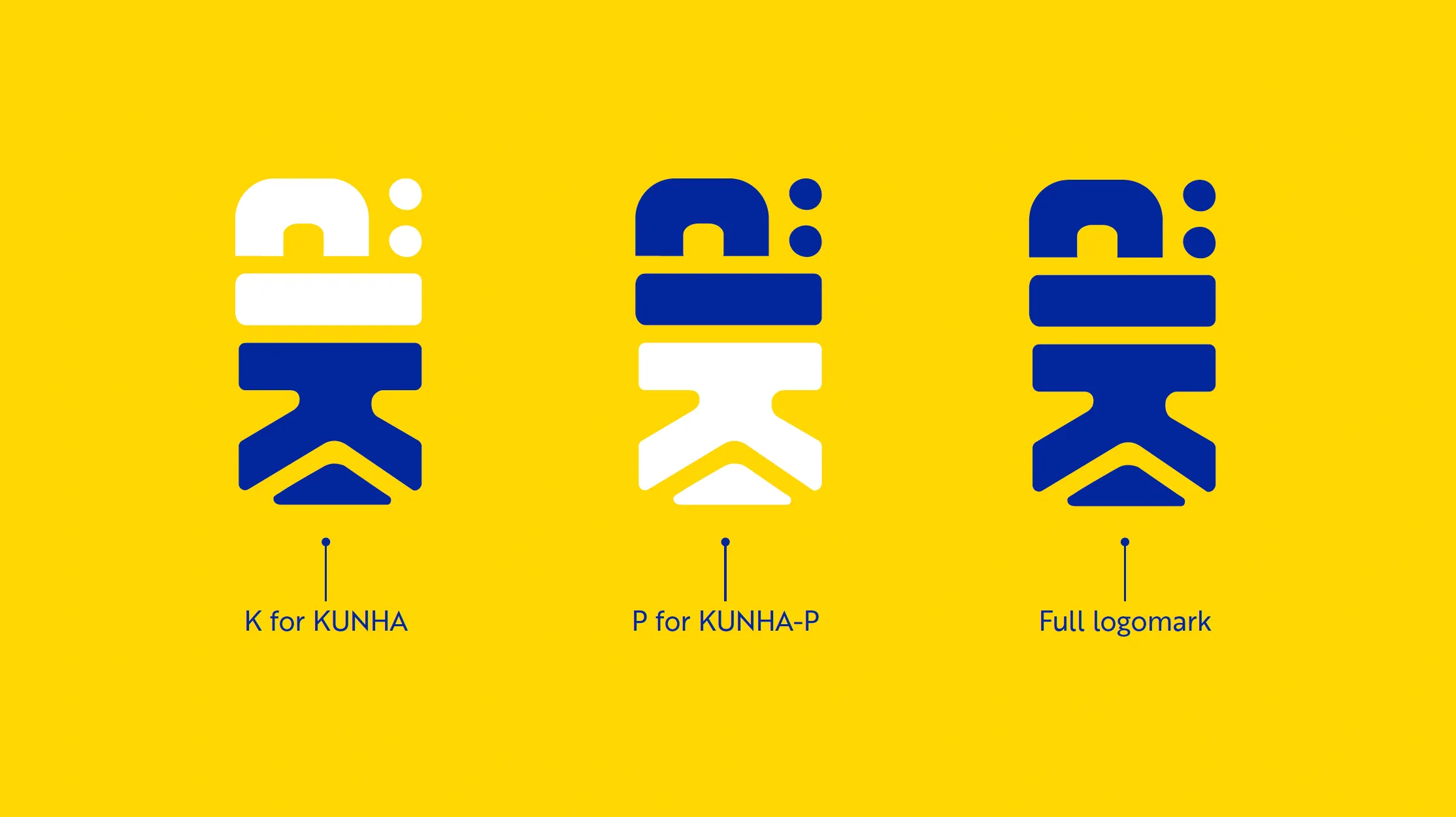
Kunha-p Visual Identity: An Icon That Speaks the Brand’s Name
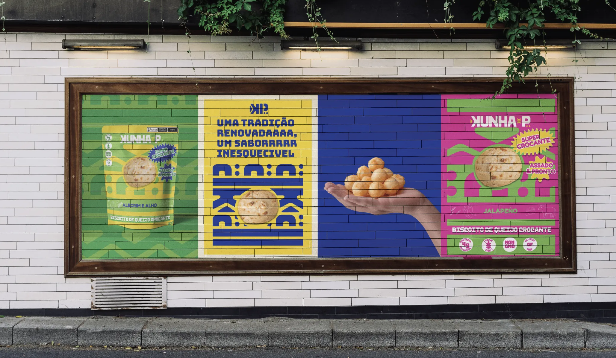
To complement the logotype, we designed a symbol merging the letters K and P, forming a compact icon that is easy to recognize and memorable at any size. This icon embraces strong geometric shapes and an indigenous aesthetic influence, representing a blend of tradition and modernity.
Finally, the intention was to create a versatile mark with a sense of reliability, fun, and innovation, the same qualities that define the brand.
Kunha-p Branding System: Patterns that Carry the Rhythm of the Brand
Kunha-p’s visual world required more than a logo. In fact, we wanted to design custom patterns that add movement and personality to the brand. Moreover, these patterns help give the packaging and promotional materials a lively, celebratory feeling, further reinforcing the cultural vibes behind the snack.


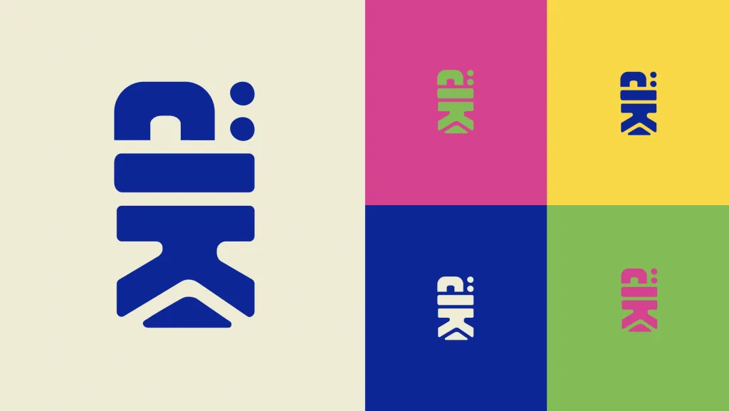
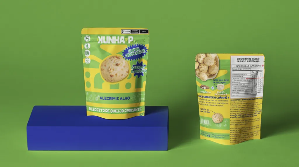
Color Palette in the Kunha-p Branding Case Study
Color plays a huge role in the Kunha-p identity. Each tone was chosen not only for aesthetic balance but also for what it communicates emotionally:
Midnight Blue brings a sense of trust and quality.
Yellow adds warmth, joy, and immediate shelf visibility.
Lime Green conveys vitality, freshness, and natural ingredients.
Electric Pink injects vibrancy and youthful energy.
Black and Off-White provide grounding, contrast, and versatility.
Overall, these colors create a palette that is eye-catching, energetic, and full of personality, just like the snack.
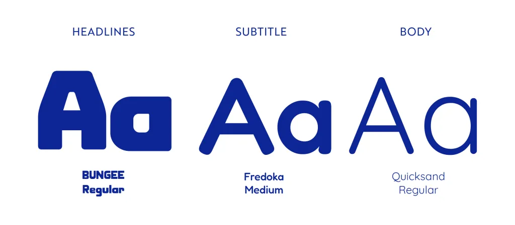
Typography That Completes the System
The type system needed to support different layers of the brand. For headlines, Bungee delivers impact and boldness. Fredoka, with its friendly rounded shapes, works perfectly for subtitles. And Quicksand offers clean readability for longer text and product information. All three together create a harmonious hierarchy that works across packaging, digital posts, and marketing materials.
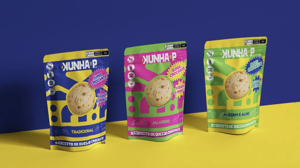
Packaging That Pops on the Shelf
Overall, designing the packaging was one of the most exciting parts of this project. We created layouts that highlight the patterns, the bright color palette, and the playful identity of the brand. The result is packaging that stands out immediately: lively, bold, and flavorful at first glance. It communicates joy and authenticity while maintaining clarity and consistency across different flavors or formats.
Branding Process Behind Kunha-p’s Visual Identity
Once the core identity was established, we expanded the system to real-world applications: mockups, social media assets, layout studies, and promotional materials. This stage is where everything comes together, proving that a strong identity works seamlessly across every touchpoint.
Seeing Kunha-p’s brand take shape across digital and physical environments confirmed the strength of the system: cohesive, flexible, and unmistakably theirs.
A Flavorful Collaboration
Creating the branding for Kunha-p was more than a design exercise, it was an opportunity to celebrate cultural identity, explore bold visual directions, and bring renewed energy to a traditional Bolivian snack. Throughout the creative process, we developed a vibrant and expressive identity system that captured the spirit of the product in its most playful form.
In the end, the client chose a more toned-down version of the branding to better align with their strategic goals and market preferences. Even so, the exploratory phase allowed us to push boundaries, experiment freely, and uncover the full potential of the brand’s personality. We had great fun developing this more expressive direction, and it played an important role in shaping the final outcome.
Kunha-p remains a project Dis Guru Design Studio is proud of: a collaboration built on creativity, trust, and the joy of designing something meaningful from the ground up.
Hello, I love what you do!
Thank you 🙂
Thank you !
Hi again!